
категории
- Новости (6)
В этом году, Pantone решила удалить свои библиотеки из Adobe Creative Cloud, где дизайнеры могли использовать их десятилетиями. Вот что вы думаете о том, как Pantone объединяет дизайнеров и полиграфистов., для лучшего или худшего.
Раннее использование – color consistency
Lawrence Herbert founded Pantone as a company in 1962. Герберт работал неполный рабочий день в коммерческой типографии., working to systematize and simplify the company’s pigment inventory. He was good at it and eventually bought the company. Pantone’s printed color fan guide and ink formulation system was a revolutionary idea that has been widely adopted over time. The idea of having a consistent set of known colors that people can share and match on the other side of town or the other side of the world is still important today. In the ’60s and’ 70s, when designs were often simpler with big, bold colors, prints worked well with black and several Pantone specialty inks. This also helps traditional printing become the norm, so 5/1 or 6/2 is feasible.
Of course, anyone who has ever used a Pantone book knows some of the problems: Pantone books are old and vary in color from book to book. While working with clients and their Pantone books, we measured six different books and compared them to PantoneLIVE. The closest is 1.2DE. The maximum distance is 5.6DE. Another problem with only matching books is that it requires a visual component, so lighting, color blindness, and many other issues arise. Still, the original idea was enough to become the de facto standard for color matching systems.
Everything is suitable — choice
Fast forward, Pantone is evolving and adding features. We now have neon, pastel and metallic options. Since 2000, Pantone has published Color of the Year. We are now also integrating into design software, most notably Adobe Creative Cloud. Almost all brand owners now use Pantone colors to identify their brand colors. Some states in the United States have passed legislation to define the colors of their flags by PMS standards. Pantone is everywhere. All of these choices can come with problems. In my experience, most problems come from a lack of education and understanding. Many designers may not understand that the vast majority of Pantone colors are not available in CMYK. In the early days, most designers understood that choosing a Pantone color meant having a particular ink. In our new digital world, this is almost impossible.
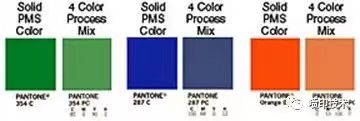
Another misconception comes from network design. With the spread of the Internet and online advertising worldwide, most brand marketers are designing for the web first. Convert the idea to a print environment later. For web design, Pantones are just pretty colors that can be used, with little thought or understanding of how they will translate to print. We have provided a design for uncoated paper with color specified Pantone C (for coated paper). Or worse, a mixture of Pantone C and U numbers. Another of our all-digital customers chose their new brand color. All six colors are screaming neon. Of the six, the closest to printing in CMYK is 5DE. Most exceed 10 dE.
CMYK number increases
IWCO Direct has moved many of our lithography customers onto our digital platform, such as our new HP PageWide press. What is the biggest sticking point for most of our customers? The inkjet press using CMYK could not precisely match the lithographic prints previously printed using spot colors on our digital inkjet press. Some clients quickly resolve these issues after discussing trade-offs like personalization and overspend savings. It takes a long time of testing to convince others to change.
Interestingly, the industry has better matching tools than we’ve ever had before. Many RIPS contain Pantone LAB values. Spectrophotometers are now widely used. Pantone colors in Creative Cloud (until they’re taken out) are more accurate than ever. Excellent process control software is available for monitoring and verification. PantoneLIVE is also easy to get.
Closing the gap
What can be done to bridge the gap? Here are a few ideas:
Use all available tools. The more you use standardized LAB values, such as those in PantoneLIVE, the more consistent you will be. If you use spot ink that should traditionally be a Pantone color, use a validation tool to confirm that it actually matches the Pantone LAB value. Use Pantone books as a last resort, and only after you have verified the book. Make sure that any Pantone library in the digital press is consistent in terms of value and render intent. The more you can standardize, the more you can use the Pantone system as originally intended.
Let your customers know the difference between Pantone on a display and how it translates to a CMYK digital press. IWCO Direct works with customers to help parties understand the strengths and limitations of the Pantone library as a matching system. Try to educate the designers you work with about the various ways they can know exactly how their designs will look when printed. Proper color Settings in Creative Cloud, understanding how to use proof colors in Cloud, and using Ink Manger to see how a design looks in CMYK are all good starting points.
Keep in mind that while Pantone is the big dog, there are other point matching systems based on CMYK that people can use. Take the Spot-Nordic/Spot Matching System as an example.

 Леон
Леон Технологии
 Менеджер по продажам